R语言空间数据可视化

在地理研究中,空间数据可视化是不可缺少的环节,也是论文中最常见的图形。本文使用ggplot2包分别展示了矢量和栅格数据的可视化方法。使用的原始数据包括最常见的shp矢量文件与tif栅格文件,也包括使用csv表格存储的点数据与栅格数据。
本文注重空间数据可视化,关于ggplot2包的基本函数,如theme()、labs()等请参考ggplot作图入门教程;关于scale_color_stepsn()等颜色设置函数请参考之前的post——R语言ggplot2包的颜色设置 | Xiaoran Wu;关于综合制图所需要的比例尺、指北针等制图要素请参考另一篇post——R语言空间数据综合制图 | Xiaoran Wu。
一、加载包与数据
1. Package
本文共使用4个包:
矢量数据处理(sf)
栅格数据处理(raster)
绘图(ggplot2)
绘制防压盖标签(ggrepel,ggplot2的一个增强补充包)
library(sf)
library(raster)
library(ggplot2)
library(ggrepel)
2. 数据
本文共使用以下数据:
Boundary_China:中国地面范围(面)
County_China:中国县级行政单位(点)
Province_China:中国的省级行政单位(面)
Road_China:中国国道路线(线)
Train_China:中国铁路路线(线)
Boundary_Heihe:中国黑河流域范围(面)
Elevation_Heihe:中国黑河区域高程数据(栅格)
Station_Heihe:中国黑河流域气象站点位置(表格)
temperature_Heihe:中国黑河流域ERA5地面温度数据(表格)
分别使用st_read()函数、raster()函数与read.csv()函数读取矢量、栅格与表格数据。
Boundary_China <- st_read('Boundary_China.shp')
County_China <- st_read('County_China.shp')
Province_China <- st_read('Province_China.shp')
Road_China <- st_read('Road_China.shp')
Train_China <- st_read('Train_China.shp')

Boundary_Heihe <- st_read('Boundary_Heihe.shp')
Elevation_Heihe <- raster("Elevation_Heihe.tif")
Station_Heihe <- read.csv("Station_Heihe.csv")
temperature_Heihe <- read.csv("temperature_Heihe.csv",
                              header = F)
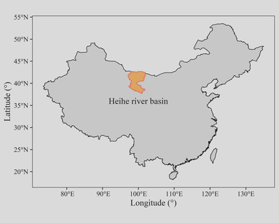
二、矢量数据可视化
1. 边界数据
使用
geom_sf()函数绘制中国与黑河流域的边界:linewidth属性设置边框宽度,color属性设置边框颜色,fill属性设置面的颜色;使用
geom_text()函数绘制黑河流域的名称;使用
coord_sf()函数设置投影:crs属性设置投影,st_crs()构建一个投影对象,这里设置的4236是WGS84的EPSG代码。
ggplot()+
  geom_sf(data = Boundary_China,
          linewidth = 0.3,
          color = "black")+
  geom_sf(data = Boundary_Heihe,
          color = "#ff645e",
          fill = "#ffb75e",
          linewidth = 0.5) +
  geom_text(aes(x = 100, y = 36),
            label = "Heihe river basin",
            family = "serif") +
  coord_sf(crs = 4236) +
  labs(x = "Longitude (°)",
       y = "Latitude (°)") +
  theme_bw() +
  theme(text = element_text(family = "serif"),
        axis.text = element_text(color = "black"),
        panel.grid = element_blank())
代码绘制的图形如下:
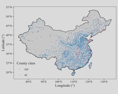
2. 点数据
使用
geom_sf()函数绘制中国的范围:使用linewidth属性设置边框宽度,color属性设置边框颜色;使用
geom_sf()函数绘制中国县级行政单位的位置点:使用color属性设置点的颜色,size属性设置点的大小;使用
coord_sf()函数设置投影。
ggplot()+
  geom_sf(data = Boundary_China,
          color = "black",
          linewidth = 0.4)+
  geom_sf(data = County_China,
          aes(color = CLASS),
          size = 0.3) +
  coord_sf(crs = st_crs(4236)) +
  scale_color_manual(values = c("#e85a71", "#4ea1d3")) +
  theme_bw() +
  labs(x = "Longitude (°)",
       y = "Latitude (°)",
       color = "County class") +
  theme(text = element_text(family = "serif"),
        panel.grid = element_blank(),
        axis.text = element_text(color = "black"),
        legend.background = element_blank(),
        legend.position = c(0.12, 0.13))
代码绘制的图形如下:
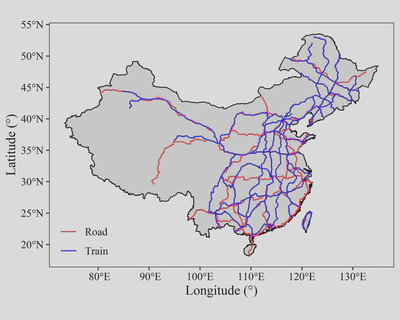
3. 线数据
先将Road_China与Train_China分别添加一个name字段,值分别为“Road”和“Train”,用以在绘制图例的时候显示名称。
使用
geom_sf()函数绘制中国的范围:使用linewidth属性设置边框宽度,color属性设置边框颜色;使用
geom_sf()函数分别绘制中国国道路线和铁路路线:使用color属性设置线的颜色;使用
coord_sf()函数设置投影。
Road_China$name <- "Road"
Train_China$name <- "Train"

ggplot()+
  geom_sf(data = Boundary_China,
          color = "black",
          linewidth = 0.4)+
  geom_sf(data = Road_China
          aes(color = name)) +
  geom_sf(data = Train_China,
          aes(color = name)) +
  coord_sf(crs = st_crs(4236)) +
  scale_color_manual(values = c("red", "blue")) +
  theme_bw() +
  labs(x = "Longitude (°)",
       y = "Latitude (°)",
       color = NULL) +
  theme(text = element_text(family = "serif",
                            size = 12),
        panel.grid = element_blank(),
        axis.text = element_text(color = "black"),
        legend.background = element_blank(),
        legend.position = c(0.1, 0.12))
代码绘制的图形如下:
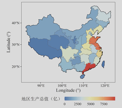
4. 面数据
使用
geom_sf()函数绘制中国省级行政单位面数据:使用fill属性设置面的颜色;使用
geom_sf()函数绘制中国的范围:使用linewidth属性设置边框宽度,color属性设置边框颜色,fill属性设置面的颜色;使用
coord_sf()函数设置投影。
ggplot()+
  geom_sf(data = Province_China,
          aes(fill = GDP_2000.)) +
  geom_sf(data = Boundary_China,
          fill = "transparent",
          color = "black",
          linewidth = 0.3)+
  coord_sf(crs = st_crs(Province_China)) +
  theme_bw() +
  scale_fill_distiller(palette = "RdYlBu") +
  labs(x = "Longitude (°)",
       y = "Latitude (°)",
       fill = "地区生产总值(亿)") +
  theme(text = element_text(family = "serif",
                            size = 12),
        panel.grid = element_blank(),
        axis.text = element_text(color = "black"),
        legend.position = "bottom",
        legend.key.width = unit(27, "pt"),
        legend.key.height = unit(10, "pt"),
        legend.margin = margin(0,0,0,0),
        legend.title = element_text(vjust = 0.9))
代码绘制的图形如下:
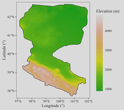
三、栅格数据可视化
首先使用mask()函数用Boundary_Heihe要素对Elevation_Heihe进行掩模提取;在栅格对象使用ggplot2可视化前,需要将其转为data.frame类型。
使用
geom_raster()函数绘制中国黑河流域的高程数据:使用fill属性设置像元的颜色;使用
geom_sf()函数绘制中国黑河流域的范围:使用linewidth属性设置边框宽度,color属性设置边框颜色,fill属性设置面的颜色。
Elevation_Heihe_mask <- mask(Elevation_Heihe,Boundary_Heihe)
Elevation_Heihe_mask_df <- as.data.frame(as(Elevation_Heihe_mask,"Raster"),xy=T)

ggplot() +
  geom_raster(data = Elevation_Heihe_mask_df,
              mapping = aes(x=x,
                            y=y,
                            fill = Elevation_Heihe)) +
  geom_sf(data = Boundary_Heihe,
          color = "black",
          fill = "transparent",
          linewidth = 0.4)+
  scale_fill_gradientn(colors = terrain.colors(6),
                       na.value = "transparent",
                       n.breaks = 5) +
  scale_x_continuous(limits = c(96.9,102.1),
                     expand = c(0,0)) +
  scale_y_continuous(limits = c(37.6,42.8)
                     ,expand = c(0,0)) +
  labs(x = "Longitude (°)",
       y = "Latitude (°)",
       fill = "Elevation (m)") +
  theme_bw() +
  theme(text = element_text(family = "serif"),
        panel.grid = element_blank(),
        axis.text = element_text(color = "black"),
        legend.key.height = unit(40, "pt"))
代码绘制的图形如下:
四、表格数据可视化
表格数据是数据本身属于点数据或像元数据,但以表格的方式进行了存储。
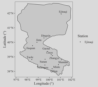
1. 点数据
使用
geom_sf()函数绘制中国黑河流域的范围:使用linewidth属性设置边框宽度,color属性设置边框颜色;使用
geom_point()函数绘制中国黑河流域的气象站点:使用color属性设置点的颜色,size属性设置点的大小;使用
geom_text_repel()函数绘制防压盖的标签。
ggplot() +
  geom_sf(data = Boundary_Heihe,
          color = "black",
          linewidth = 0.4)+
  geom_point(data = Station_Heihe,
             mapping = aes(x = lng,
                           y = lat,
                           color = station_name),
             size = 0.5) +
  geom_text_repel(data = Station_Heihe,
                  mapping = aes(x = lng,
                                y = lat,
                                label = station_name),
                  family = "serif",
                  size = 3.3) +
  scale_color_grey(start = 0, end = 0,
                   breaks = c("Ejinaqi")) +
  scale_x_continuous(limits = c(96.9,102.1),
                     expand = c(0,0)) +
  scale_y_continuous(limits = c(37.6,42.8)
                     ,expand = c(0,0)) +
  labs(x = "Longitude (°)",
       y = "Latitude (°)",
       color = "Station") +
  theme_bw() +
  theme(text = element_text(size = 12, family = "serif"),
        panel.grid = element_blank(),
        axis.text = element_text(color = "black"))
代码绘制的图形如下:
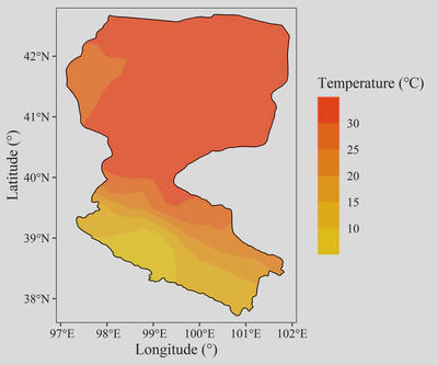
2. 栅格数据
前五行代码分别进行了以下操作:
将温度的开尔文单位转换为摄氏度;
将表格类型类型的temperature_Heihe转为矩阵(方可作为raster()函数的输入);
使用
raster()函数将temperature_Heihe矩阵转为栅格类型,同时定义其边界经纬度;使用
mask()函数用Boundary_Heihe要素对Elevation_Heihe进行掩模提取;将其转为data.frame类型。
进行预处理后进行绘制:
使用
geom_raster()函数绘制中国黑河流域的高程数据:使用fill属性设置像元的颜色,alpha属性设置不透明度;使用
geom_sf()函数绘制中国黑河流域的范围:使用linewidth属性设置边框宽度,color属性设置边框颜色,fill属性设置面的颜色。
temperature_Heihe <- temperature_Heihe - 273.15
temperature_Heihe <- as.matrix(temperature_Heihe)
temperature_Heihe <- raster(temperature_Heihe,
                            xmn = 96,
                            xmx = 103,
                            ymn = 36,
                            ymx = 44)
temperature_Heihe_mask <- mask(temperature_Heihe,Boundary_Heihe)
temperature_Heihe_mask_df <- as.data.frame(as(temperature_Heihe_mask,
                                              "Raster"),
                                           xy=T)

ggplot() +
  geom_raster(data = temperature_Heihe_mask_df,
              mapping = aes(x=x,
                            y=y,
                            fill = layer),
              alpha = 0.8) +
  geom_sf(data = Boundary_Heihe,
          color = "black",
          fill = "transparent",
          linewidth = 0.4)+
  scale_fill_steps2(low = "blue",
                    mid = "yellow",
                    high = "red",
                    na.value = "transparent",
                    n.breaks = 6) +
  scale_x_continuous(limits = c(96.9,102.1),
                     expand = c(0,0)) +
  scale_y_continuous(limits = c(37.6,42.8)
                     ,expand = c(0,0)) +
  labs(x = "Longitude (°)",
       y = "Latitude (°)",
       fill = "Temperature (℃)") +
  theme_bw() +
  theme(text = element_text(size = 12, family = "serif"),
        panel.grid = element_blank(),
        axis.text = element_text(color = "black"),
        legend.key.height = unit(25, "pt"),
        legend.key = element_rect(fill = "transparent"))
代码绘制的图形如下: